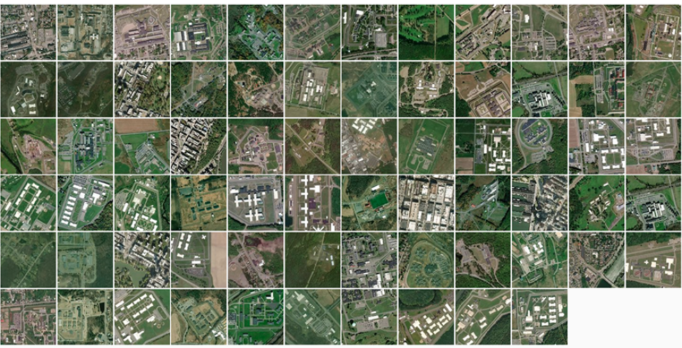
With a 56% reduction in prison population since 2000, 26 prisons in New York State have closed and more are set to be closed. Layering these closures with policies, economic and community impact, pushback, political positions, environmental concerns, as well as the decentralization of the criminal justice system, this research seeks to envision post-prison futures in the rural towns of upstate New York. It also explores the flows and transfers through the prison economy that interconnect these towns and New York City. A range of visions focus on prisons, towns or the system of mass incarceration, and consider state infrastructures- carceral, water, food, power, waste- as urban exostructures.
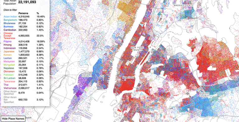
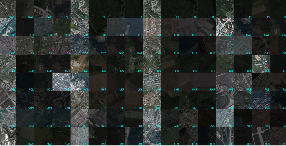
The Asian American Dot Density map represents each Asian American as 1 dot color coded by 21 different racial groups found in Census data. The map reveals the complex spatial dynamics of specific asian racial groups in places across the country.
Asian American Dot Density Map
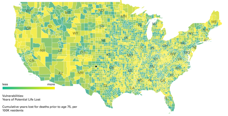
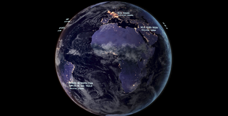
Mapping the New Politics of Care is a visual journey through the inequities and vulnerabilities that define the American landscape, using different definitions to describe communities at risk, down to the county level. The project is also designed to show visitors how the areas that appear most at risk within each state shifts depending on how vulnerability is measured: from COVID-19 cases to unemployment rates, from COVID-19 deaths to formal metrics of health vulnerability such as Years of Potential Life Lost and the Centers for Disease Control and Prevention’s Social Vulnerability Index.
Mapping the New Politics of Care

Mapping the New Politics of Care is a visual journey through the inequities and vulnerabilities that define the American landscape, using different definitions to describe communities at risk, down to the county level. The project is also designed to show visitors how the areas that appear most at risk within each state shifts depending on how vulnerability is measured: from COVID-19 cases to unemployment rates, from COVID-19 deaths to formal metrics of health vulnerability such as Years of Potential Life Lost and the Centers for Disease Control and Prevention’s Social Vulnerability Index.
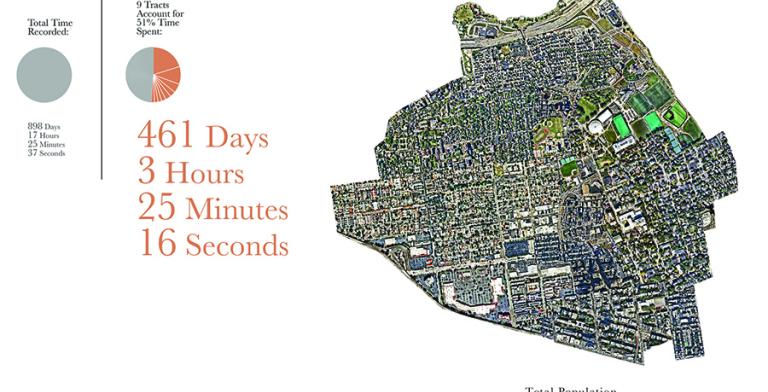
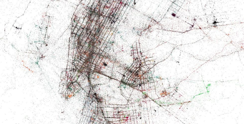
This project visualizes the U.S. Census through the lens of 1 person’s location data over the course of 3 years. It addresses the potential of self quantification in the personalization of public aggregate data. We are constantly viewed through data collected from us. However, despite the increasing nuance and sophistication of classification and categorization systems, the formalization of categories is always going to be playing catch up to how we can define ourselves. Is it possible that we can challenge the transactional nature of our current relationship with data by viewing aggregate data through the lens of self knowledge?
Personal Census Atlas
Methods in Spatial Research introduces key concepts required for work with geographic information systems (GIS) and spatial research in the urban humanities.
The Center for Spatial Research is seeking student assistants for the Spring 2019 semester. We are seeking candidates to assist with several ongoing projects. Student assistants will work closely with CSR staff in a collaborative research environment. Specific roles and responsibilities vary by project and are outlined in this post.
This hybrid theory/practice course provides an introduction to critical mapping discourse and geographic information systems tools. Of particular interest to humanities students, it examines both historical and contemporary questions with reference to the technology of mapping. Additionally, through the use of open-source GIS software (QGIS), browser-based technologies (Mapbox, Mongo DB), and open data (OpenStreetMap), students will learn how to critically use mapping tools and geographic data for spatial analysis and representation.
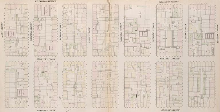
Mapping Historical New York: A Digital Atlas visualizes Manhattan’s and Brooklyn’s transformations during the late-nineteenth and early-twentieth centuries. Drawing on 1850, 1880, and 1910 census data, it shows how migration, residential, and occupational patterns shaped the city.
Mapping Historical New York
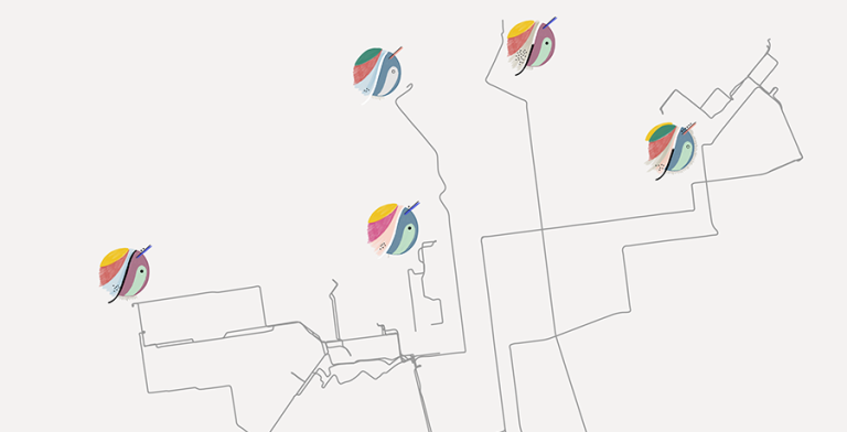
We Can is a multimedia storytelling project that explores the lives and activity of canners, people who pick up cans and bottles on NYC streets. We combined oral history, manual data collection, mapping and illustration to encourage a more critical observation of a community and its subculture. The mapping component consists in GPS tracked canners’ daily itineraries that unfold, while revealing the quantitative and qualitative data collected manually.
We Can